Miller's Law: when a little less becomes a great plus for User Experience
By Céline Mourrier - Published : 21 Oct, 2025
3 min read

Miller's Law: when less becomes a plus for great UX
Have you ever felt overwhelmed by a new app or website? Well, you are not the only one. When it comes to user interface design, a fundamental psychological principle guides us: Miller's Law.
Formulated by the cognitive psychologist George A. Miller in 1956, this law suggests that human short-term memory has a limited capacity. More precisely, it states that we can only retain about seven, plus or minus two, pieces of information at a time. This is the famous "magical number 7, plus or minus 2."
Why is this so vital for interface design ?
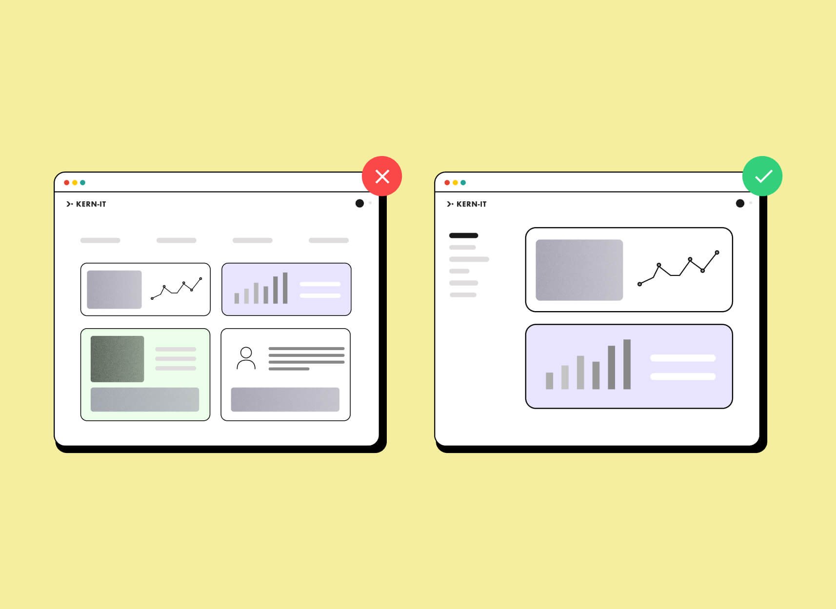
In today's fast-paced digital world, understanding Miller's Law is essential. Information overload is never beneficial. The human brain accepts only a limited number of pieces of information. The more information your website contains, the more difficult it becomes to use.
If an interface displays too many elements at once, the users may feel overwhelmed. They won't know where to look or what to do. This cognitive overload can lead to frustration, errors, and ultimately, make your user quit your product or service entirely.
Keep it short and simple: Concrete Examples
This is why it is absolutely essential to keep user interfaces simple and concise.
At Kern-IT, our goal is to reduce mental effort to a minimum. This is what that means in practice:
- Navigation Menus: A navigation menu should ideally have a maximum of 7 entries (or between 5 and 9). Exceeding this makes the structure difficult for the user to quickly understand or remember. This rule is reflected in Apple's mobile OS guidelines, which only permit a maximum of five tabs in primary navigation bars.
- Limit the number of options displayed: Instead of overwhelming the user with too many choices, group similar options together, use smart drop-down menus, or sequential steps.
- Structure the information : Highlight the most important elements and place secondary information further back or in dedicated sections.
- Use "chunking": Group related information into small, manageable blocks ("chunks"). This explains why telephone numbers are typically shown in groups of digits (e.g., 0476 12 34 56) rather than as a long sequence.
- Avoid useless information: Every element on the screen must serve a clear purpose. If it doesn't, it creates noise and reduces clarity.
The advantage ? A great user experience
By applying Miller's Law, we improve the user experience by simplifying the information presented and limiting the cognitive load. Restricting the number of elements shown at once helps users focus on the most important information. This allows them to make decisions faster, accomplish their tasks more efficiently, and ultimately, have a smoother and more enjoyable experience.
At Kern-IT, simplicity is our priority
At Kern-IT, we firmly respect this fundamental law in all our creations. We are committed to ensuring that every interface we develop is designed to be as clear and logical as possible. For us, the "keep it simple" principle is a guideline that ensures your users can navigate, interact, and achieve their goals without effort or frustration.
Always remember: a good interface is one that doesn't ask the user to think too hard.