When two pixels derail a project: the Law of Triviality at work
By Khalid Yagoubi - Publication : 26 Jun, 2025
3 min read


At KERN IT, every production launch is a mini-victory.
Code is done, details are double-checked, tests are green, the rollout is smooth, users are ready, and the whole team shares that feeling: "This is it!"
Yet, a single message is often enough to freeze the entire process:
“The button color doesn't match the brand's pink exactly.”
“The text-to-icon alignment is slightly off.”
“The padding between these two paragraphs is too large.”
“There is a casing error on this word.”
I once saw a client cancel a major sales demo because the main button wasn't the exact shade of pink from the brand guidelines.
On another occasion, a stakeholder went as far as using a wooden ruler to check the spacing between two sections on his newly launched homepage.
In the meantime, strategic priorities are put on hold.
User experience is pushed to the sidelines.
The core message? Lost in the abyss of pixel-level trivialities.
Understanding the Law of Triviality
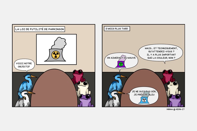
This phenomenon is actually a known principle: Parkinson's Law of Triviality, often referred to as "The Bike-Shed Effect".
The story traces back to a committee responsible for validating plans for a nuclear reactor. Faced with such a complex and expensive project, everyone just nodded along, hesitant to speak up.
However, as soon as the debate shifts to the color of the bike shed, everyone chimes in. Everyone has something to say, and hours are poured into a trivial matter just because it’s easy to understand.
In the context of a digital project, it looks like this:
- The UX flow? Let’s push that to later.
- The content? Still not approved.
- But that button over there, it’s a bit too far to the left, isn’t it?

Why we are all prone to this pitfall
Because discussing a button is simple, whereas tackling profound strategic questions is far more demanding:
- Is the UI truly intuitive?
- Is our value proposition clear to the user?
- Does the product effectively meet the target need?
- Is the message clear, consistent, and aligned with the company's vision?
Answering these questions demands deep thought and high-level strategy. Yet, critiquing a stray pixel or a heavy shadow is easy and immediate; it’s a safe comment that avoids the difficult conversations about the project's core.
It’s human. It’s comfortable. But it’s also a waste of time.
The concrete impact
Projects that stall and lose momentum.
Launch blocked by details that 99% of users will never notice.
Development teams wasting precious time on micro-aesthetic adjustments while the product’s core remains stagnant.
The biggest risk: a false sense of rigor that masks a lack of strategic focus.
Our 'No Bike-shedding' approach
Before sharing feedback, we encourage you to consider three key points:
- Does this feedback truly improve my users' experience?
- Does it provide actual value to the product or the company?
- Am I just looking for a flaw for the sake of "giving feedback"?
If you answer 'no' to all three, you're dealing with a detail. Details can be handled later; they are not a valid reason to block a project.
The KERN IT Way
We appreciate clients with high standards.
Specifically, those who have a clear vision of what takes priority.
Yes, we will fix that capital letter.
Yes, we will align that button.
Yes, we will eyedrop the exact shade of pink.
Our real motivation lies in creating purposeful, well-designed tools that address genuine challenges. That requires focusing on the core, not just the surface.
Our approach is to launch early, learn fast, and improve what truly matters.
As Reid Hoffman so rightly put it:
"If you're not embarrassed by the first version of your product, you've launched too late." Reid Hoffman


